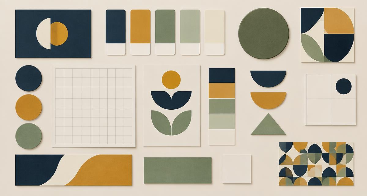
We spent more on packaging design than on our first year of advertising, and it has done more work.
## Three decisions that held
One format across the range so refills are unambiguous. A label hierarchy that leads with what the product is for rather than the brand name. Enough contrast to read at arm's length in poor light, which is how products are actually seen on a shelf.
## One we would reverse
We used a colour system to distinguish variants and it fails for anyone who shops by memory rather than by reading. A shape or texture cue would have carried more of the load. Colour alone asks the customer to remember your system.
Where this applies
- Branding
- Graphic Design
Work with Verdehouse
This article comes from the work Verdehouse does. See what they offer, the results they can evidence, and how to start a conversation.
More from Verdehouse
- PlaybookA lifecycle email programme for a repeat purchase brandFive flows carry almost all of the revenue: welcome, first-purchase onboarding, replenishment, refill reminder, and lapsed. Everything else we have built has been a rounding error by comparison.
- FrameworkA creative testing grid for paid socialTesting one variable at a time is too slow for paid social and testing everything at once teaches nothing. A grid of angle by format keeps it legible.
- FindingProduct page copy tests that actually moved revenueEleven product page tests across a year of trading in refillable home care. Four moved revenue per session, three moved add-to-cart but not revenue, and four did nothing worth keeping.
- PlaybookMigrating a subscription programme without losing subscribersWe moved 4,000 active refill subscriptions between platforms. Churn rose for two weeks and then settled below where it started. The communication plan did more work than the technical plan.
- ArticleLaunching a consumer brand in technical communitiesRefillable products attract sceptics who know the chemistry, the logistics and the greenwashing playbook. Launching where those people already talk was uncomfortable and better than any influencer push.